Lecture 6 (Chapter 2). Technical Analysis
In this lecture you will see what is technical analysis?

Thandiwe Mbeki
Published · Updated

Trend, Support & Resistance, Candlesticks, and the Order Book
A different lens on the same shares
Everything so far in this course - financial statements, macro conditions, valuation multiples falls under fundamental analysis: understanding what a company is actually worth. Technical analysis is a different discipline entirely: it studies price and trading activity itself, on the theory that price patterns reflect the collective behaviour of every buyer and seller in the market, and that certain patterns tend to repeat.
This course covers only the essentials, enough to read a chart intelligently and understand the vocabulary you'll encounter everywhere in financial media. For a full, dedicated treatment of chart patterns, moving averages, momentum indicators, and volatility tools with real JSE case studies, see our companion course, Guru of technical analysis in 10 steps.
Trend: the most basic concept in technical analysis
A trend is simply the general direction a share's price is moving over time:
- Uptrend is a pattern of higher highs and higher lows; each rally pushes further up than the last, and each pullback doesn't fall as far as the previous low.
- Downtrend is the mirror image: lower highs and lower lows.
- Sideways (or range-bound) is a price oscillates between a fairly consistent upper and lower boundary without a clear directional bias.
The old trading adage "the trend is your friend" reflects a genuine statistical tendency: an established trend is more likely to continue than to reverse at any given moment, though it never continues forever, which is exactly why the next concept matters.
Support and resistance: the market's memory
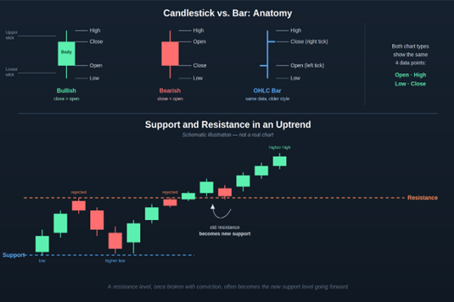
Support is a price level where a share has historically tended to stop falling and bounce back up - enough buyers consistently step in at that level to absorb selling pressure. Resistance is the mirror image: a price level where selling pressure has historically overwhelmed buying pressure, capping further gains.
These levels form because market participants remember them. Investors who missed buying at a previous low often place orders to buy if the price returns there, reinforcing that level as support again. When a price finally breaks through a well-established resistance level with strong volume, that former resistance often flips to become new support going forward. A phenomenon technical analysts watch closely as a signal that sentiment has genuinely shifted.
Candlesticks: more information than a simple line chart
A line chart only shows you the closing price for each period. A candlestick chart shows four data points per period (day, hour, week - whatever timeframe you're viewing) in a single visual:
- Open — the price at the start of the period
- Close — the price at the end of the period
- High — the highest price reached during the period
- Low — the lowest price reached during the period
Candles-Support-Resistance
The rectangular body of the candle spans the distance between open and close — coloured (conventionally green or white) if the close was higher than the open, and a different colour (typically red or black) if the close was lower. The thin lines above and below the body. The wicks or shadows show the full high-to-low range for the period, revealing how far price moved before settling back.
A single candle tells you the story of a trading session at a glance: a long body with short wicks shows strong, decisive conviction in one direction; a small body with long wicks on both ends shows a session where price swung significantly but ultimately closed near where it opened is often a sign of indecision between buyers and sellers.
The order book: bid/ask depth, beyond just the top price
Back in Lecture 1, we covered the basic bid (highest price a buyer will pay) and ask (lowest price a seller will accept). The order book extends this idea by showing the full stack of buy and sell orders waiting at every nearby price level, not just the best one.
Reading the order book gives a live sense of supply and demand pressure just above and below the current price: a large cluster of buy orders sitting just below the current price can act as a short-term cushion, since it would take significant selling to push through all of them. A thin, sparse order book, by contrast, can mean price moves more erratically on relatively small trades, since there's less standing demand or supply to absorb them. Most retail brokerage platforms display at least a simplified version of this, often labelled "market depth."
Key takeaways
- Technical analysis studies price and trading behaviour directly, as a complement to (not a replacement for) fundamental analysis.
- Trends are sequences of higher highs/higher lows (up) or lower highs/lower lows (down); ranges move sideways between boundaries.
- Support and resistance are price levels where buying or selling pressure has historically dominated and a broken resistance level often becomes new support.
- A candlestick shows open, high, low, and close in one visual - far more information than a simple closing-price line.
- The order book shows the full depth of standing buy and sell orders, giving a live read on near-term supply and demand pressure.
Key Indicators: Moving Averages, MACD, RSI, and Volatility
Turning price history into a signal
The tools from the Lecture - trend, support/resistance, candlesticks are read visually. Indicators go a step further: they take price (and sometimes volume) data and run it through a formula, producing a number or line that highlights something not always obvious from the raw chart alone. This lecture covers the four most common ones you'll encounter. For a full, dedicated exploration of each with real JSE chart examples, see the course related to technical analysis
Moving Averages: smoothing out the noise
A moving average (MA) takes the average closing price over a fixed number of recent periods (say, the last 50 days) and plots it as a single smooth line, recalculated fresh each day as the window "moves" forward. This filters out the day-to-day zigzag of raw price, making the underlying trend easier to see.
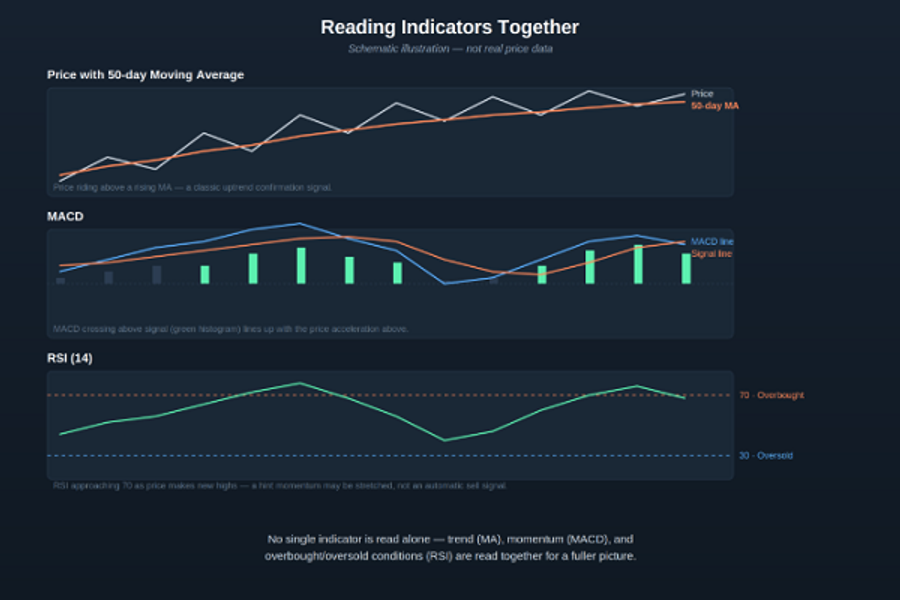
Two common types: a Simple Moving Average (SMA) weights every day in the window equally; an Exponential Moving Average (EMA) weights recent days more heavily, making it react faster to new price action. Two MA lengths are watched especially closely: the 50-day (medium-term trend) and the 200-day (long-term trend). When a shorter MA crosses above a longer one, it's called a golden cross -often read as a bullish trend-confirmation signal; the reverse, a shorter MA crossing below a longer one, is a death cross - a bearish signal. Price trading consistently above a rising MA (as in the top panel below) is one of the simplest, most widely used trend-confirmation checks in technical analysis.
MACD: momentum via the relationship between two EMAs
MACD (Moving Average Convergence Divergence) measures momentum by tracking the relationship between two EMAs of different lengths. The MACD line is the difference between a 12-period EMA and a 26-period EMA; a signal line (a 9-period EMA of the MACD line itself) is plotted alongside it; and a histogram shows the gap between the two as vertical bars.
The key signal: when the MACD line crosses above the signal line, it suggests upward momentum is building (shown as the histogram turning positive/green in the middle panel below); when it crosses below, downward momentum is building. MACD is fundamentally a momentum tool, not a price-level tool. It tells you about the speed and direction of price movement, which is a different kind of information than trend or support/resistance.
RSI: is the move overextended?
RSI (Relative Strength Index) is an oscillator that moves between 0 and 100, measuring the speed and size of recent price changes to gauge whether a share has moved "too far, too fast" in one direction. The standard readings:
- Above 70 - often described as overbought, suggesting the recent rally may be stretched and due for a pause or pullback
- Below 30 - often described as oversold, suggesting the recent decline may be stretched in the other direction
Crucially, RSI crossing these thresholds is a caution flag, not an automatic buy or sell trigger. A genuinely strong uptrend can keep RSI elevated above 70 for extended periods without reversing, so it's best read alongside trend and momentum, exactly as shown in the bottom panel below.
Indicators stack
Volatility: gauging fear itself
The tools above analyse a share's own price. A volatility index measures something different: how much price swing the broader market currently expects, based on options pricing. The best-known example globally is the CBOE VIX, often nicknamed the market's "fear gauge," built from S&P 500 options.
South Africa has its own equivalent: the SAVI (South African Volatility Index), launched by the JSE in 2007 and explicitly modelled on the VIX , giving investors a way to gauge positive or negative sentiment in the local equity market — when volatility is low, it typically reflects a degree of complacency or lack of fear among market participants. The SAVI is derived from the prices of options on the JSE Top 40 Index , calculated as a weighted average of the implied volatilities of those options to produce a forward-looking measure of expected market risk. Like the VIX, a rising SAVI signals rising market anxiety. Useful context for a JSE investor, since it reflects sentiment about the whole market, not any single share, and tends to spike sharply during periods of macro stress.
Reading all three together, practically
No single indicator is used in isolation by an experienced trader. A common approach: use a moving average to establish the underlying trend, MACD to gauge whether momentum currently supports that trend, and RSI to check whether the recent move looks overextended. All three pointing the same direction (trend up, MACD positive, RSI not yet overbought) is a stronger signal than any single one alone, while a rising RSI approaching 70 alongside slowing MACD momentum can be an early hint that a rally is losing steam, even while price itself is still making new highs.
Key takeaways
- Moving averages smooth price into a trend line; a golden cross (short MA above long MA) and death cross (short MA below long MA) are widely watched trend-confirmation signals.
- MACD measures momentum via the relationship between two EMAs - a MACD line crossing above its signal line suggests building upward momentum.
- RSI (0–100) flags when a move may be overextended - above 70 is often read as overbought, below 30 as oversold but it's a caution flag, not an automatic trade trigger.
- South Africa's SAVI, modelled on the US VIX, measures the market's expected volatility using JSE Top 40 options pricing - a broad sentiment gauge rather than a single-stock tool.
- Trend, momentum, and overbought/oversold conditions are strongest read together, not individually.